FIGMA ESSENTIALS
WEEK ONE
Review the fundamental steps for the proper development of a UX UI project:
Take a Brief was taken from http://www.randomprojectgeneration.com. Random projects dot com is an excellent tool since it offers a brief that challenges you to carry out a project from scratch, just as happens in work life.
Then the LoFi Wireframe was designed; Figma is a tool that allows you to develop a LoFi Wireframe with text and animations. This is favorable to understanding the process and behavior of the project.

At this point, it is a must to investigate colors, ideas, and the concept you want to manage through a Mood board.


Low Fidelity Wireframe


For the culmination of the first week, it was proposed to design the project logo that had to be worked on according to the brief. In my case, it was the development of a company that sold coffee-making machines.
Below I present my process to create the first page of the app.
Below I present my process to create the first page of the app.
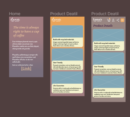
Here it is valid to clarify that the logo was changed; This is done because the script type did not handle a bold concept for brand development.
For this part of the project we learned to design our own buttons and icons; It will always be better to create your own icons for a page than to depend on image banks.
For this part of the project we learned to design our own buttons and icons; It will always be better to create your own icons for a page than to depend on image banks.


WEEK TWO
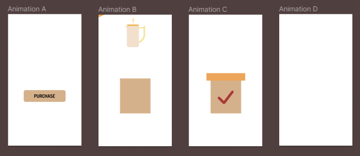
For the second week, the topics were: button animation, pop-up, and Responsive Layout were designed using the components tool to create behaviors that demonstrate animation.
After the animation and illustration section, we learned how to create registration forms: information button and error in the field to fill out. Learning how to animate in Figma helped to create variants.


Another topic that is related to page animation is the pop-up design, this is handled a lot on products/services that can benefit the consumer in the short, medium, or long term, such as the newsletter or discounted products.

Continuing with the cycle of animations in Figma, I had the opportunity to learn how to animate in Figma through statics; I would dare to say that it is like stop animation since it is done based on boxes, but it looks somewhat more fluid than breaks with the character of stop animation.

WEEK THREE
This week you learned how to execute transitions on a page and how these transitions play into the overall design; The transitions perform a certain behavior that is usually interesting and effective when it comes to shortening «scroll in a page» times and directing the user to a specific destination.

Continuing with the theme of animation, there is a type of animation that is used by many called Micro Interactions; Macro interactions are actions that allow the user to see if an action is being executed properly, for example turning on/off, selecting, sensitivity when touching an object that can lead them to perform an action, etc. (since there are many actions that can be performed on one page, I only name a few of these.)

After everything learned in these three weeks, you can now run the High Fidelity (HiFi) Wireframe, and thus the Udemy Figma UI UX Design Essentials course comes to an end; For this last delivery, the mobile and desktop mock-up had to be completed.

